My Journey into Japanese UX
I’ve been an anime fan for years, so Japanese media has always been a part of my daily life. Ever since I started working with a Japanese client, my experience has been completely different.
[Just to clarify, I’m at iXora Solution Ltd, a company that helps develop products for the Japanese companies]
I now spend a lot of time using Japanese websites and apps, not just for entertainment, but for real work.
As part of my role in QA and product, I also get the chance to work closely with Japanese designers and observe how people here interact with technology. And honestly, it’s nothing like what you’d see in America or Europe.
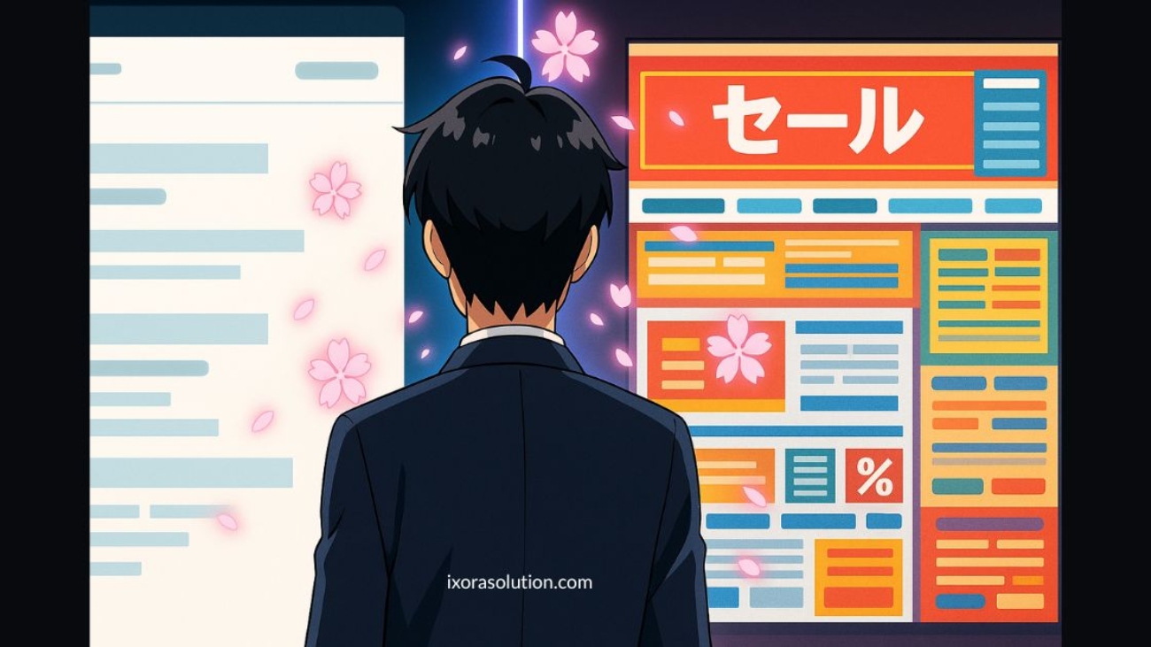
I still remember the first time I seriously looked into a Japanese e-commerce platform. I was shocked. The websites looked like they hadn’t moved on since the early 2000s text-heavy pages, flashing banners, inconsistent font sizes, and color combinations that felt overwhelming. If you showed this to a Western designer, they’d probably call it “bad design” on the spot.
But these so-called “badly designed” websites are insanely successful.
Japan still dominates the market despite looking outdated. Rakuten, with its cluttered interface, consistently outperforms Amazon in Japan. From a business standpoint, these designs work.
That’s when I started asking myself: why? What’s really happening here?
Through my work and observation, I’ve realized it’s not about good or bad design in the Western sense but it’s about a completely different mindset for digital experiences.
Japanese users value clarity, information density, and trust signals differently than Western users do. Once I understood that, the design choices made a lot more sense. (Mclaren Group UX Research)
Part 1: Trust Works Differently Here

Everything Upfront, or Nothing at All
In Japan, hiding information makes people suspicious.
Let me give you an example.
In America, you might see a clean product page with a “Learn More” button. Simple. Elegant.
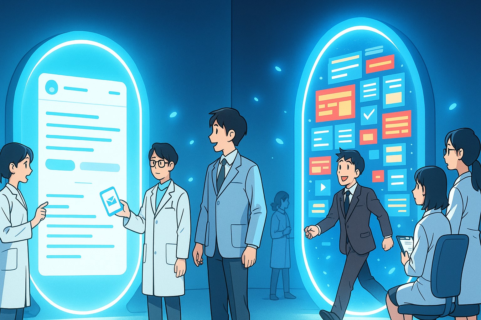
In Japan? That same product page will have everything on it. Every specification. Every feature. Every possible question answered. All right there.
Why? Because Japanese customers think: “If you’re not showing me everything, what are you hiding?”
One of my close colleagues shared this story from their previous company. They had designed a very clean six-step signup wizard — one question at a time, very modern and simple. But their Japanese users hated it. Instead, they wanted to see all 70 input fields on a single page. Yes, all 70 on one page.
When my colleague’s team asked why, the users gave a fascinating reason: “I want to know what you’ll ask me before I start. I want to prepare my answers. I want to understand the whole process.”
So instead of filling as they went, they would actually read through the entire form first, from top to bottom, and only then go back and fill it out.
The Fear of Making Mistakes
Making a mistake in Japan is a big deal. Bigger than you might think.
This fear shapes everything. That’s why you see:
- Forms that make you confirm three times
- Websites that explain every tiny detail
- Instructions for things that seem obvious
- Warning messages everywhere
It’s not that Japanese people are less capable. They just really, really don’t want to make mistakes. And companies know this. So, they design for zero mistakes, even if it means more complexity.
The Physical Store in Your Browser
Here’s something wild I noticed. Japanese websites look like Japanese stores.
Ever been to Don Quijote? It’s this famous discount chain. The stores are insane. Stuff crammed everywhere.
Handwritten signs. Bright lights. Music playing. Multiple signs for the same product. It’s sensory overload.
Their website? Exactly the same feeling.
Or take Yodobashi Camera. Massive electronics store. Every surface covered with prices and promotional stickers. Staff yelling out deals. Flashing lights everywhere.
Their website? Flashing banners. Dense product grids. Text everywhere.
This isn’t accident. Japanese people expect online shopping to feel like real shopping. And real shopping in Japan is intense.
Part 2: The Language Changes Everything
Why Japanese Fonts Are a Nightmare
OK, this is technical but super important.
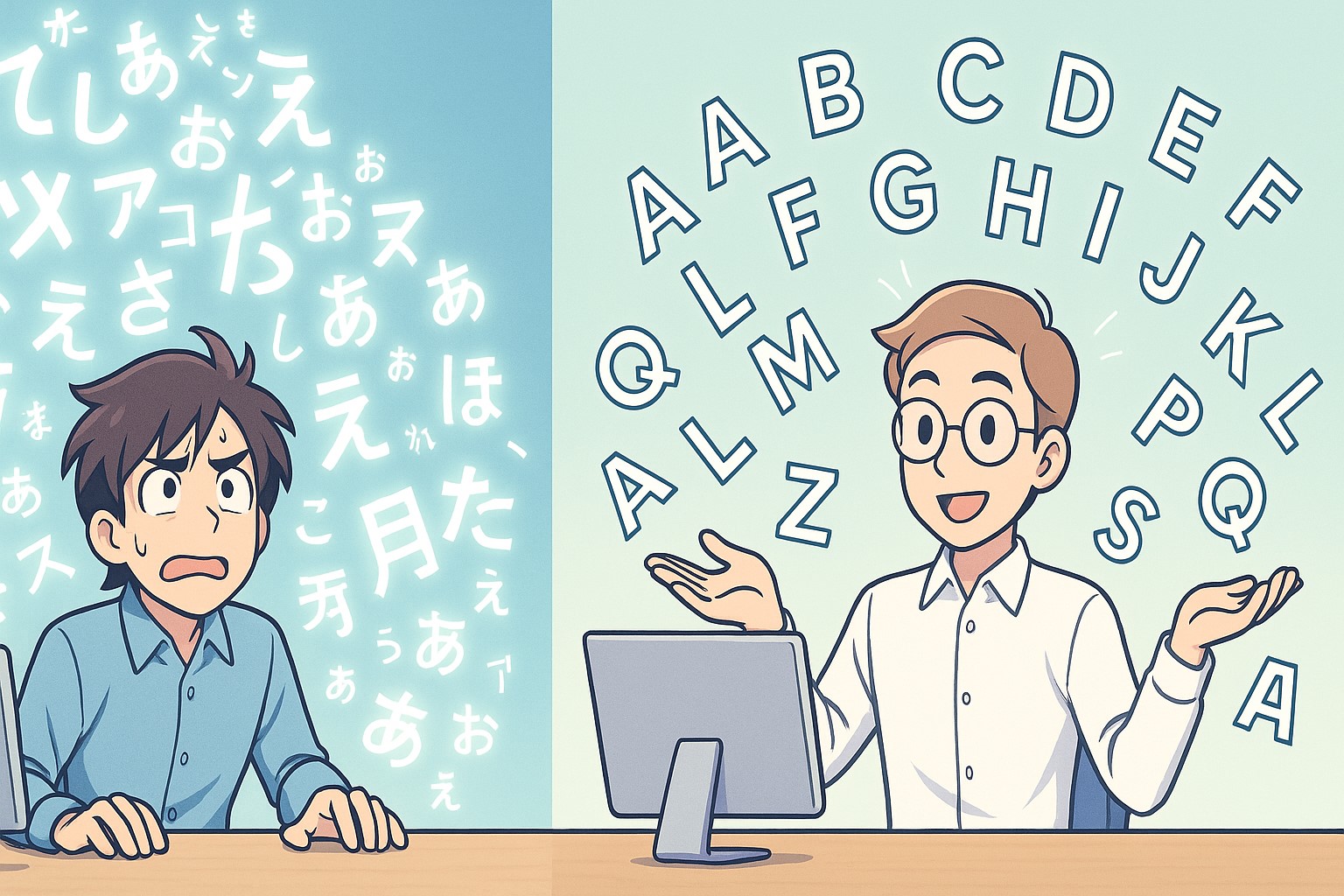
To make an English font, you need to design about 230 characters. All the letters, numbers, some symbols. That’s it.
To make a Japanese font? You need between 7,000 and 16,000 characters.
Seriously.
Japanese uses three different writing systems:
- Hiragana (46 characters)
- Katakana (46 characters)
- Kanji (thousands and thousands of Chinese characters)
Creating a new font takes years. Teams of people. Massive budgets.
So what happens? Most websites use the same few fonts. And designers can’t rely on typography to create visual hierarchy like Western designers do.
No Capital Letters, Big Problems
In English, I can write “IMPORTANT” and you know it’s important. The capitals tell you.
Japanese doesn’t have capitals. Everything is the same height. Same visual weight.
So how do you make something stand out? You:
- Make it bigger
- Change the color
- Put a background behind it
- Add decorations around it
- Use images instead of text
This is why Japanese sites have so many colored boxes, borders, and image-based text. They’re trying to create hierarchy without the tools Western designers take for granted.
Reading Patterns Are Different
Japanese can be written horizontally or vertically. Most websites use horizontal text now. But advertisements, banners, and traditional content still go vertical.
This means Japanese readers are trained to scan in multiple directions. They’re comfortable with text coming at them from all angles. What looks chaotic to Western eyes feels normal to Japanese eyes.
Part 3: The Technology Time Machine
Still Using Internet Explorer in 2025
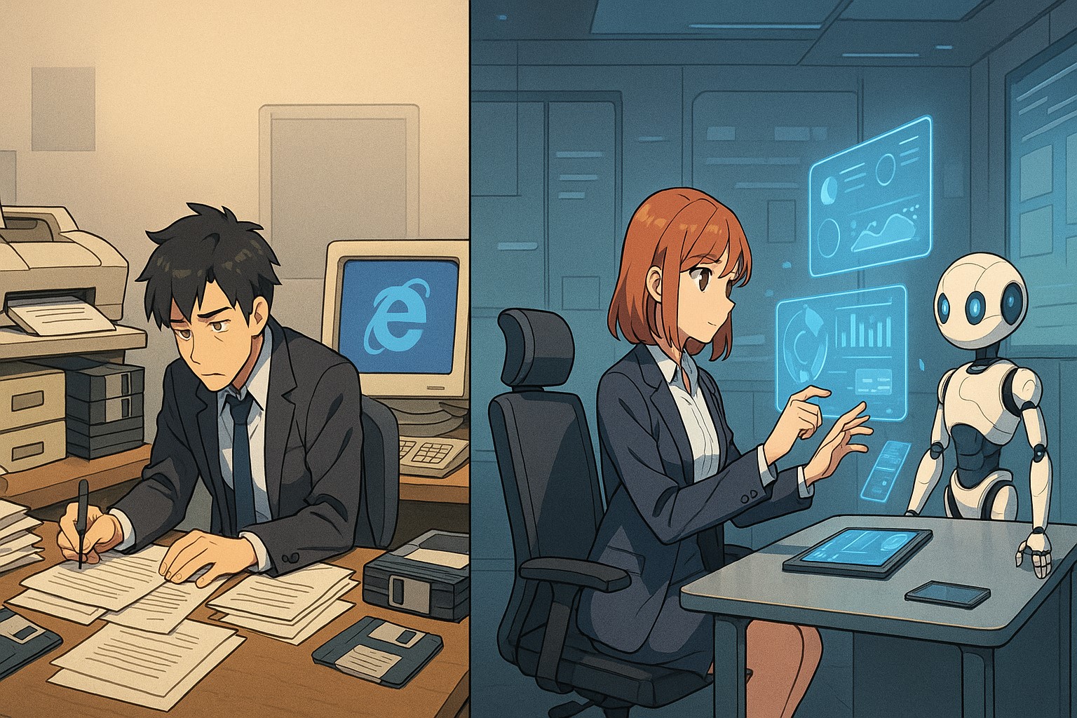
This blows people’s minds. Major Japanese companies still require Internet Explorer. In 2025.
Why? Because they have internal systems built in 1995 that only work in IE. Rebuilding would cost millions. And might break. So they don’t.
I’ve seen companies pass around USB sticks because their cloud storage “isn’t proven secure yet.” I’ve watched people print emails, stamp them with personal seals, and file them in physical folders.
But the same office might have a robot receptionist.
This is Japan. Cutting-edge and ancient at the same time.
The Fax Machine Problem
Japan still loves fax machines. Government offices require them. Doctors use them. Real estate agents need them.
When COVID hit, the government wanted people to work from home. But they needed their fax machines. So many people… went to the office just to check the fax.
This matters for web design because many websites are designed to be printed. Then faxed. So they’re dense with information. Black and white friendly. Everything on one page.
The web page isn’t the real document. It’s just a screen version of a paper document.
Jobs vs. Efficiency
Here’s something nobody talks about.
Some Japanese websites are intentionally hard to use. Why? To preserve jobs.
I learned this from a designer at a major bank. They could make their online banking much simpler. But then they wouldn’t need the staff who help customers use the ATMs. Those people would lose their jobs.
In America, efficiency is everything. Automate everything. Reduce headcount.
In Japan? Companies feel responsible for their employees. They’d rather keep a complicated system that requires human help than fire people.
This hit me hard when I understood it. What looks like bad UX might actually be intentional job preservation.
Part 4: How Decisions Really Get Made
The Committee Problem
In Silicon Valley, a CEO can say “Change the design” and it changes.
In Japan? Impossible.
Every decision needs consensus. Not just from bosses. From everyone affected. This process is called “nemawashi” – it means “preparing the roots.”
Before any meeting about design changes, you need to:
- Talk to each stakeholder privately
- Get their concerns
- Address those concerns
- Get informal agreement
- THEN have the official meeting
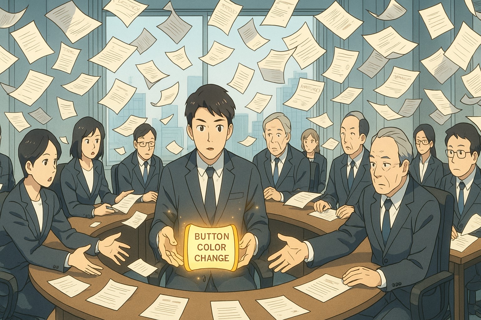
This can take months. For one design change.
I watched a friend try to update a single button color. Three months. Twelve meetings. Four departments involved. The button stayed the same color.
Designers Have No Power
In America, designers at big tech companies make good money. They’re respected. They influence product direction.
In Japan? Designers are often the lowest paid people in tech. They’re seen as “makers” not “thinkers.” They do what they’re told.
Most companies don’t even have in-house designers. They outsource to agencies. The agencies do what the client wants. The client wants what they’ve always had.
It’s a cycle that prevents innovation.
The Agency Monopoly
Two giant advertising agencies – Dentsu and Hakuhodo – control most of Japanese web design. They do everything. Design, development, marketing, media buying.
Companies trust them completely. Too completely.
The agencies often never meet real users. They design based on what the client executives want. Those executives might be 60 years old and barely use the internet. But they make the decisions.
This is why many Japanese sites feel frozen in time. They’re designed for the approval of people who don’t actually use them.
Part 5: The Two Faces of Japanese Design
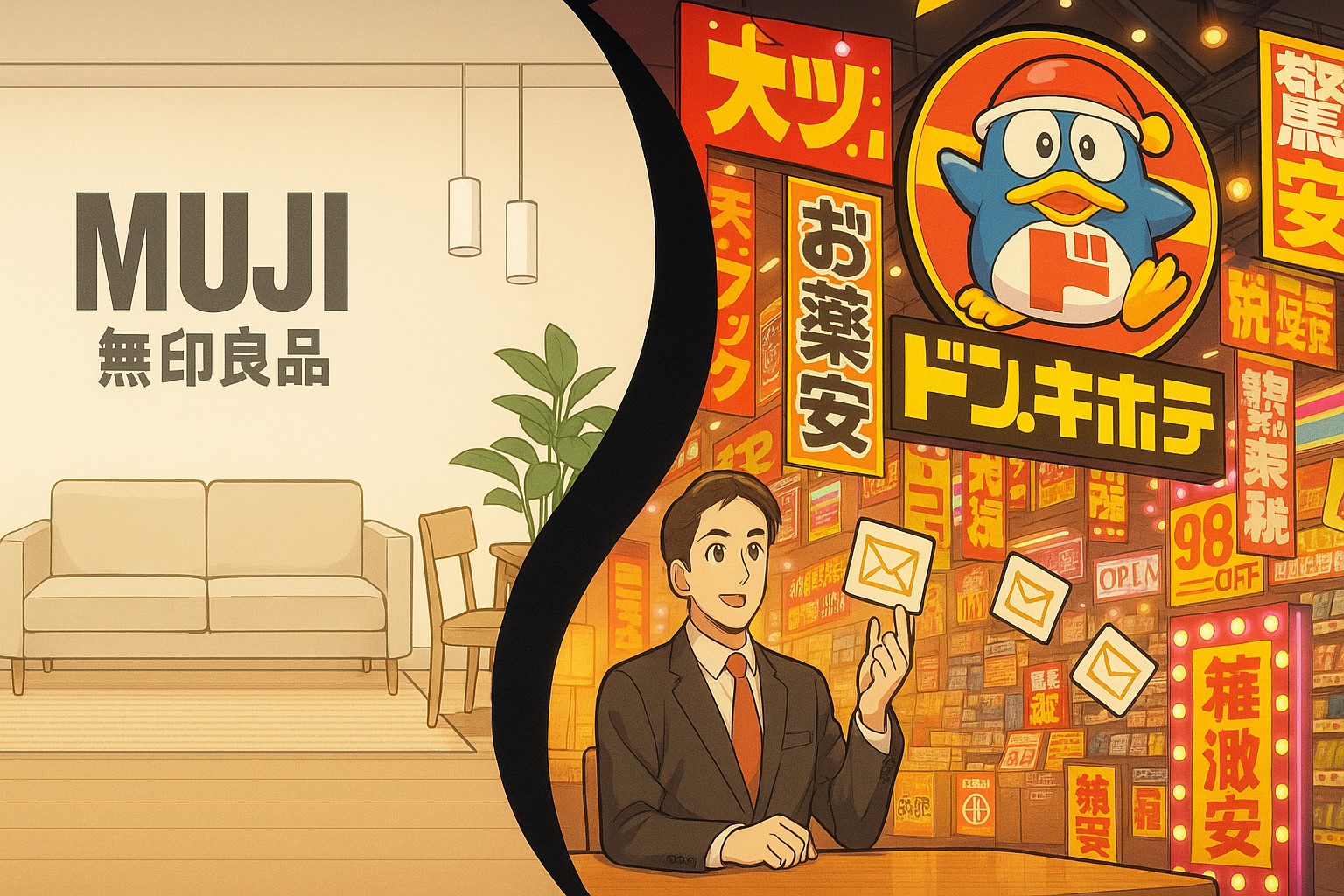
Minimalism Still Exists (But It’s Expensive)
Everyone knows about Japanese minimalism. Clean lines. Empty space. Zen aesthetics.
This still exists. But it signals luxury now.
MUJI’s website? Beautiful and minimal. High-end fashion? Clean and simple. Expensive restaurants? Elegant and sparse.
But regular stores? Information overload. News sites? Packed with text. E-commerce? Chaos.
There are two different design languages:
- Minimalism = expensive, premium, artistic
- Complexity = everyday, practical, trustworthy
Why Everything Has a Mascot
Every Japanese company has a cute character. Banks have mascots. The police have mascots. Even the tax office has a mascot.
This seems childish to Westerners. But it’s not.
Characters make institutions feel human. Approachable. Less scary. In a culture where making mistakes is terrifying, a cute character saying, “Let’s file taxes together!” reduces anxiety.
These mascots work. They build emotional connections. They make complex processes feel friendlier.
Plus, Japanese culture believes spirits live in everything. Animation and characters feel natural, not childish.
Part 6: What Actually Works
The Numbers Don’t Lie
Rakuten tested cleaner designs. The cluttered one converts better. Yahoo Japan tried modernizing. Users complained. They switched back. Amazon Japan added MORE information to product pages. Sales went up.
These companies A/B test everything. If Western-style design worked better, they’d use it. They don’t because it doesn’t.
At least not for Japanese users.
Different Markets, Different Designs
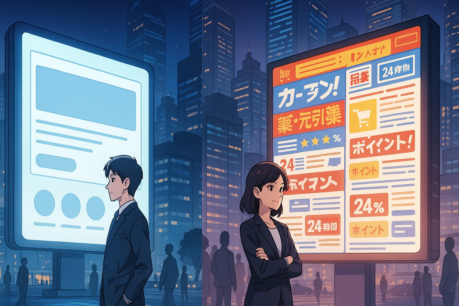
Smart global companies maintain completely different designs for Japan.
Starbucks Japan’s website has way more information than Starbucks USA. Amazon Japan is denser than Amazon USA. Even Apple adds more text to their Japanese site.
They learned something important: You can’t just translate. You need to completely redesign for Japanese expectations.
The Success Stories
Some companies found a middle way.
Mercari is the best example. They took Western UX principles but adapted them for Japan. Clean but informative. Simple but complete. They stole massive market share from Yahoo Auctions.
How?
– They understood what to keep (information transparency) and what to change (visual clutter).
The key wasn’t copying Western design. It was understanding which parts work in Japan.
Part 7: How Things Are Changing
Young Designers Push Back (Carefully)
Young Japanese designers know about Western design. They use Instagram. They see clean interfaces. They want to modernize.
But they can’t just rebel. That’s not how Japan works.
Instead, they’re slowly introducing changes:
- Slightly more white space
- Better mobile experiences
- Cleaner typography (while keeping information density)
- Modern interactions (but with familiar patterns)
Change is happening. Just very, very slowly.
Mobile Forces Change
Smartphones are changing everything. Finally.
Phone screens are small. You can’t fit everything. Companies are forced to prioritize. To simplify.
Young people especially expect better mobile experiences. They use global apps. They know what’s possible.
But even mobile change is uniquely Japanese. Where American apps hide features in hamburger menus, Japanese apps use tab bars with tiny icons to keep everything visible.
COVID Accelerated Digital Adoption
COVID forced Japan online. Grandparents learned to video call. Schools went digital. Government services moved online (slowly).
This is creating pressure for better UX. More people are using digital services. They’re comparing experiences. They’re demanding better.
But “better” in Japan still means different things than in the West.
Part 8: The Deeper Meaning
It’s Not About Technology
The differences in Japanese web design aren’t really about technology. Or language. Or even aesthetics.
They’re about values.
Japanese culture values:
- Group harmony over individual expression
- Complete information over elegant simplicity
- Avoiding mistakes over moving fast
- Preserving jobs over maximum efficiency
- Trust through transparency over trust through curation
These values create design.
The Mirror of Society
Websites reflect society.
American sites reflect American values: Speed. Efficiency. Innovation. Individual choice.
Japanese sites reflect Japanese values: Thoroughness. Reliability. Stability. Group consensus.
Neither is wrong. They’re just different.
What We Can Learn
The real lesson isn’t about design. It’s about assumptions.
We assume our way is the right way. But Japanese UX proves there are many “right” ways.
What works depends on:
- Who your users are
- What they value
- What they expect
- How they think
- What makes them comfortable
Japanese design teaches us to question everything. Even things that seem obviously “correct.”
Conclusion: Beyond Better or Worse
I’ve spent years frustrated by Japanese websites. Then years defending them. Now I understand them.
They’re not better or worse than Western design. They’re optimized for different humans with different needs.
A Japanese person looking at a minimal Western site might feel:
- Anxious (what aren’t they telling me?)
- Suspicious (seems too simple, probably a scam)
- Frustrated (where’s the information I need?)
A Western person looking at a dense Japanese site feels:
- Overwhelmed (too much information)
- Confused (what’s important here?)
- Annoyed (why can’t they simplify?)
Both reactions are valid. Both designs are solving real problems. Just different problems.
The future isn’t Japanese design becoming Western. Or Western design becoming Japanese.
The future is understanding that humans are different. Cultures are different. And good design respects those differences.
There’s no universal good design. There’s only good design for specific people in specific contexts.
And that’s a beautiful thing.
Experience the iXora Solution difference as your trusted offshore software development partner. We’re here to empower your vision with dedicated, extended, and remote software development teams. Our agile processes and tailored software development services optimize your projects, ensuring efficiency and success. At iXora Solution, we thrive in a dynamic team culture and experience innovation in the field of custom-made software development.
Have specific project requirements? Personalized or customized software solutions! You can contact iXora Solution expert teams for any consultation or coordination from here. We are committed to maximizing your business growth with our expertise as a custom software development and offshore solutions provider. Let’s make your goals a reality.
Thanks for your patience!
Add a Comment